BTS: Restoring the Black Phantom

Restoring the Black Phantom Artwork
by Jim Burrows
I thought it might be interesting to take our readers behind the scenes of the creation of our first Sankofa Comic, Steve Perrin’s Black Phantom. This article will show the process we used to remaster one of the key pages of the origin of the first African-American costumed vigilante/superhero. The Black Phantom was created for issue #4 of the Mask and Cape fanzine by Steve Perrin. The story, an illustrated text adventure, was printed like many early amateur zines using the ‘spirit-master’ process known in the US as ‘Ditto’ and the UK as ‘Bando’. Ditto pages were a pale purple color on relatively cheap paper that could fade considerably over time.
I scanned a borrowed copy of Mask & Cape #4 and, with careful tuning of the scan parameters, got something that looked like this:
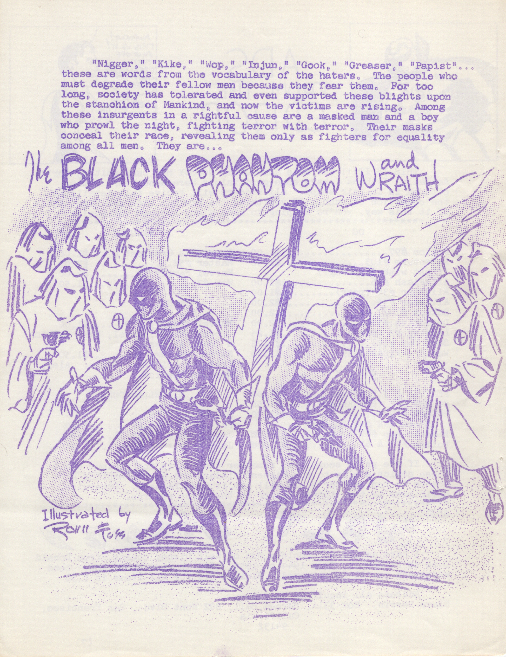
This is actually a pretty good representation of the existing page. If anything, the page was more faded than this image would suggest. Still, to use it in our Black & White and Deluxe Color remastered comics, I need a high-contrast B&W image. This image is pale purple on a somewhat yellowed background, and there is bleed-through from the other side. Simply adjusting the darkest color to be black and the lightest to be white would result in something like this:
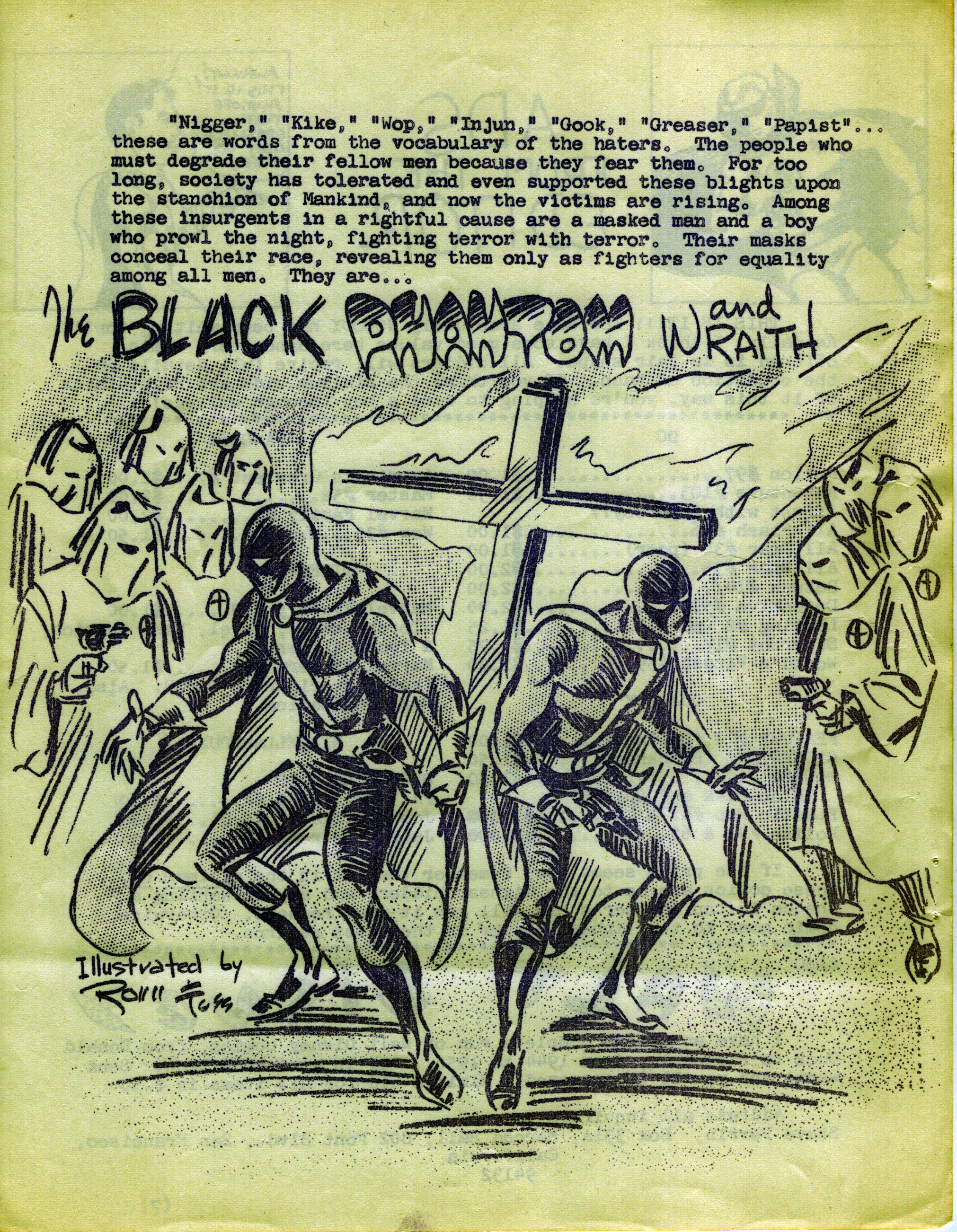
You can see the aging of the paper, the shadows and highlights created by the wrinkling of the page, and the bleed-through from the other side. To remove these I first did the exact opposite. I selected all the black ink and a pixel or so around it from this enhanced image. I then went back to a copy of the original scan and using Photoshop’s ‘content-aware fill’ feature, removed the ink. This left me with a scan of just the paper.
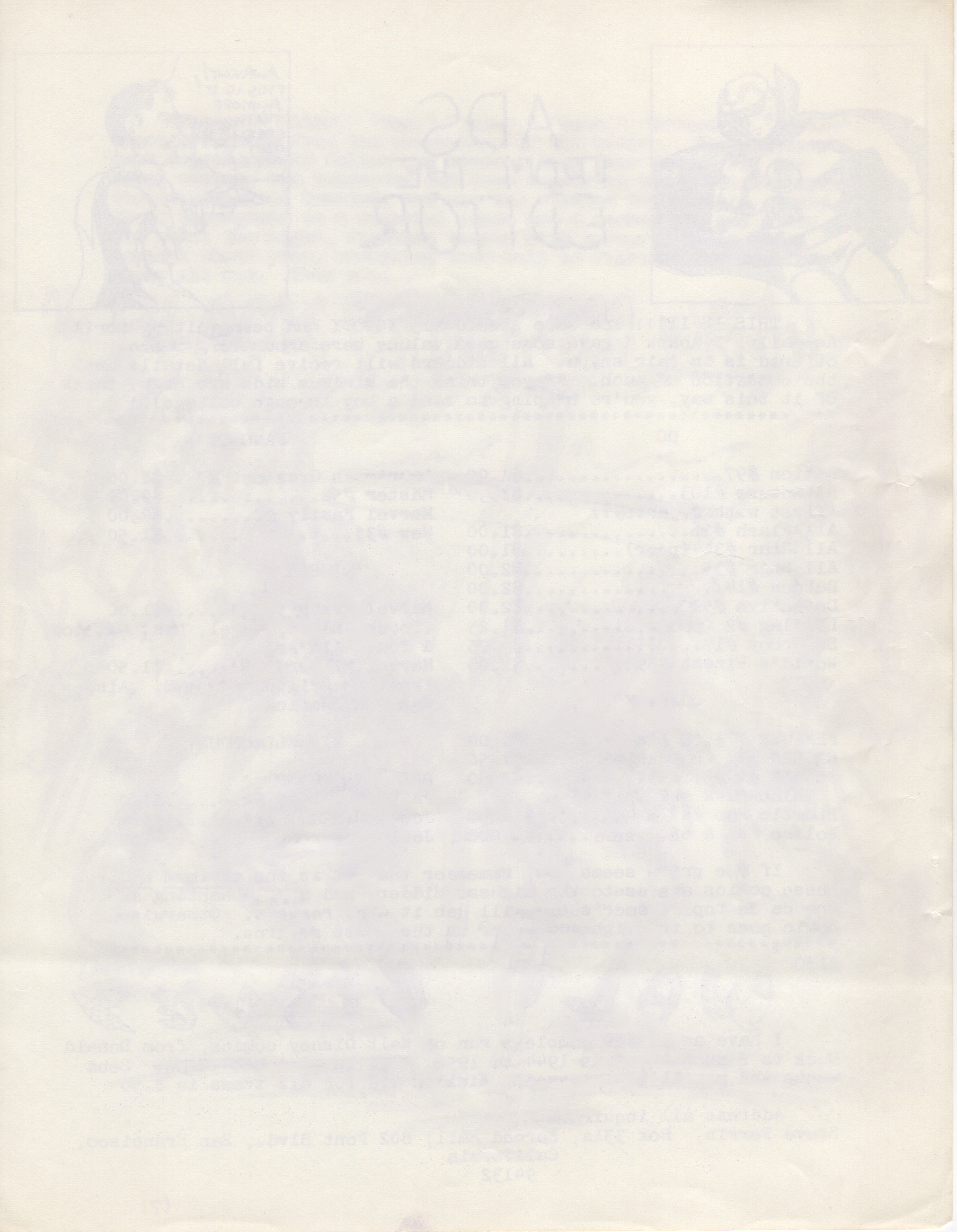
You can see the crease in the lower portion of the page and the bleed-through from the other side of the paper. For instance, the Golden Age Green Lantern is visible in the upper right next to the word ADS from that page’s title, in reverse. This image is blurry because the Content-Aware Fill replaces each inked pixel with one based on its neighbors. While this isn’t a particularly sharp image of the paper it is good enough for the next step, which is to subtract this image out of the raw scan, using Photoshop’s ‘Divide’ blend mode. This results in a version of the scan that looks very similar to the original but stands up much better to being enhanced.
For instance, if I use the ‘Levels’ adjustment simply to enhance the monochromatic contrast, I get what a really crisp ditto page would look like—pretty much the best that an original fanzine page might have looked. Alternatively, if I hand-tuned all the color levels individually and then convert the results to grayscale, I could get a crisp black and white, which after a bit of touch-up would be a B&W image that can be used for production. Here’s what both of those look like side-by-side.
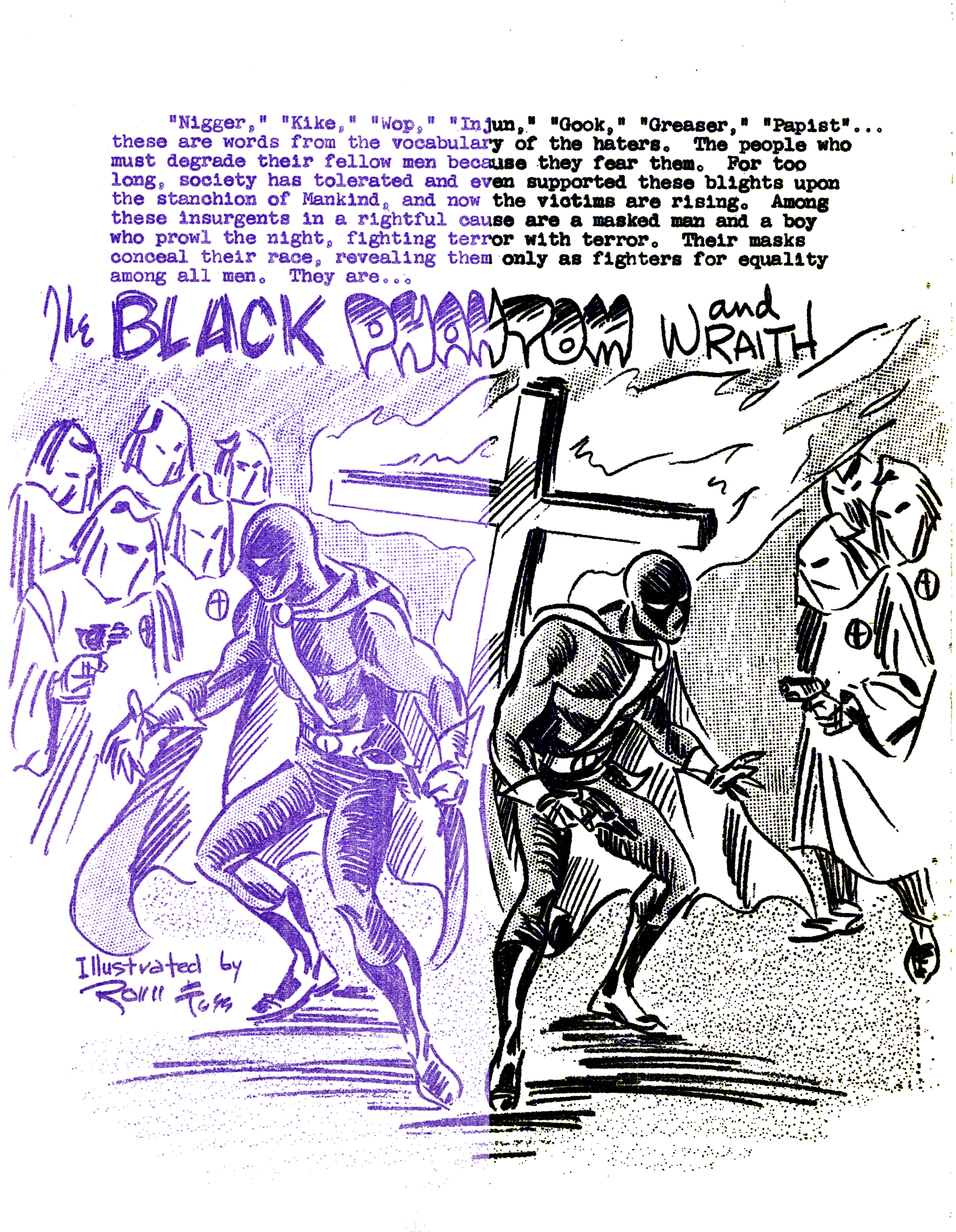
For the black and white remastered edition, we now have a useable image to be pasted into the reconstructed page, which I re-set using a typewriter-style font.
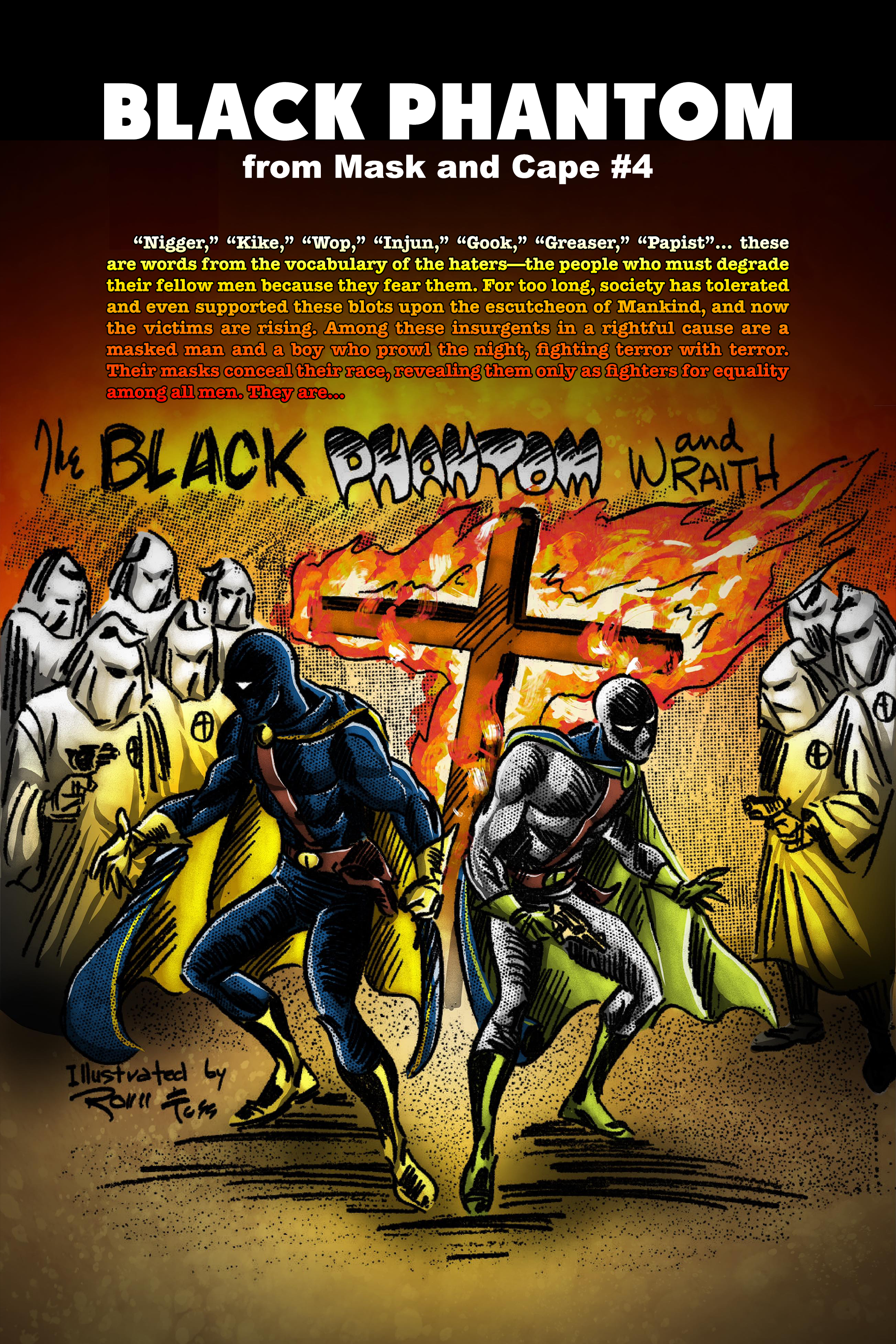
We also used the same production-ready B&W image as the basis for the page in the Remastered Deluxe Color Edition. I shipped it off to David Ellis Leary, who was coloring not only this page but the full comic book version of the Black Phantom origin that appeared in Fantasy Illustrated #6 two years after the text version.
David produced a beautiful image in blazing color against a black background that really brings out the feel of our heroes facing the Brotherhood of the Flaming Cross at night. This called for carrying over the fiery colors into the text. I used the same fonts and text as in the B&W edition, but set the title and subtitle in white, and used a custom flame-colored gradient for the body text. Here’s how the final version came out:
